Duration: Feb 2019 - Mar 2019 (2 days)
Tools: Hand Tools, Keynote
My Role: Set Dresser / Art Department / Visual Designer
Film Website Link: https://www.pie-film.com/
YouTube Link: https://youtu.be/c_dx_NJE5J4
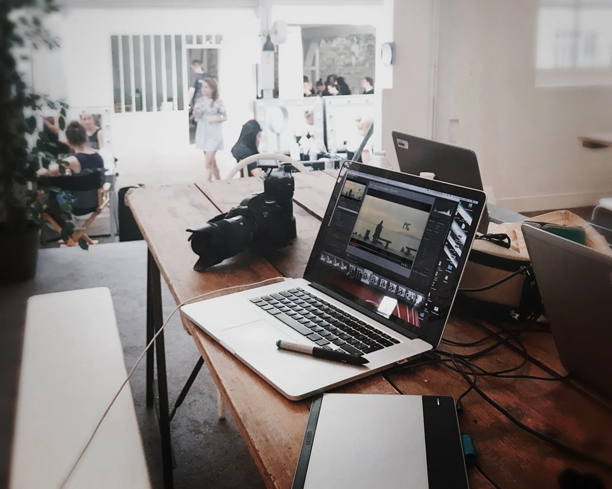
For this project, I worked with the video production studio, The Cabinet, on a film short called “Pie,” where we follow a man who is tragically faced with on a daily basis with barrage of pies to the face. I worked under the Art Department as a Set Dresser, where I helped the Art Director pick-up and deliver furniture rentals for the shoot as well as set up the spaces we were going to be shooting.
Additional responsibilities included resetting props between takes and breaking down the set when we were finished with the shoot and mocking up a generic pie-chart graphic for one of our scenes.
Duration: May 2018 - June 2018 (1 week)
Tools: Adobe Photoshop CC, Adobe Illustrator CC, Power Point
My Role: Mobile Production Designer
For this project, I worked with Jack Morton Worldwide in their San Francisco office with their client Docker for DockerCon on exporting and managing mobile assets for a HQ inspired trivia game for mobile. This mobile game was intended to be an engaging and interactive element for the conference to challenge attendees knowledge and also encourage more participation in conference activities.
After exporting out all of the assets for mobile so the development team can build the app I was invited by the Art Director on this project to create animation sequences for different elements on the artwork which would be used for the mobile app and during presentation.
One idea I had was to take these existing rings and have them oscillating around the logo at different frame rates and alternate directions. A second idea I had was to have the colorful circle elements travel around the the map and they could slowly fade out, disappear behind the land masses.
Duration: Apr 2018 - May 2018
Tools: Adobe Photoshop CC, Adobe Illustrator CC, Indesign CC, After Effects CC, Keynote
My Role: Design & Video Production
Video Links:
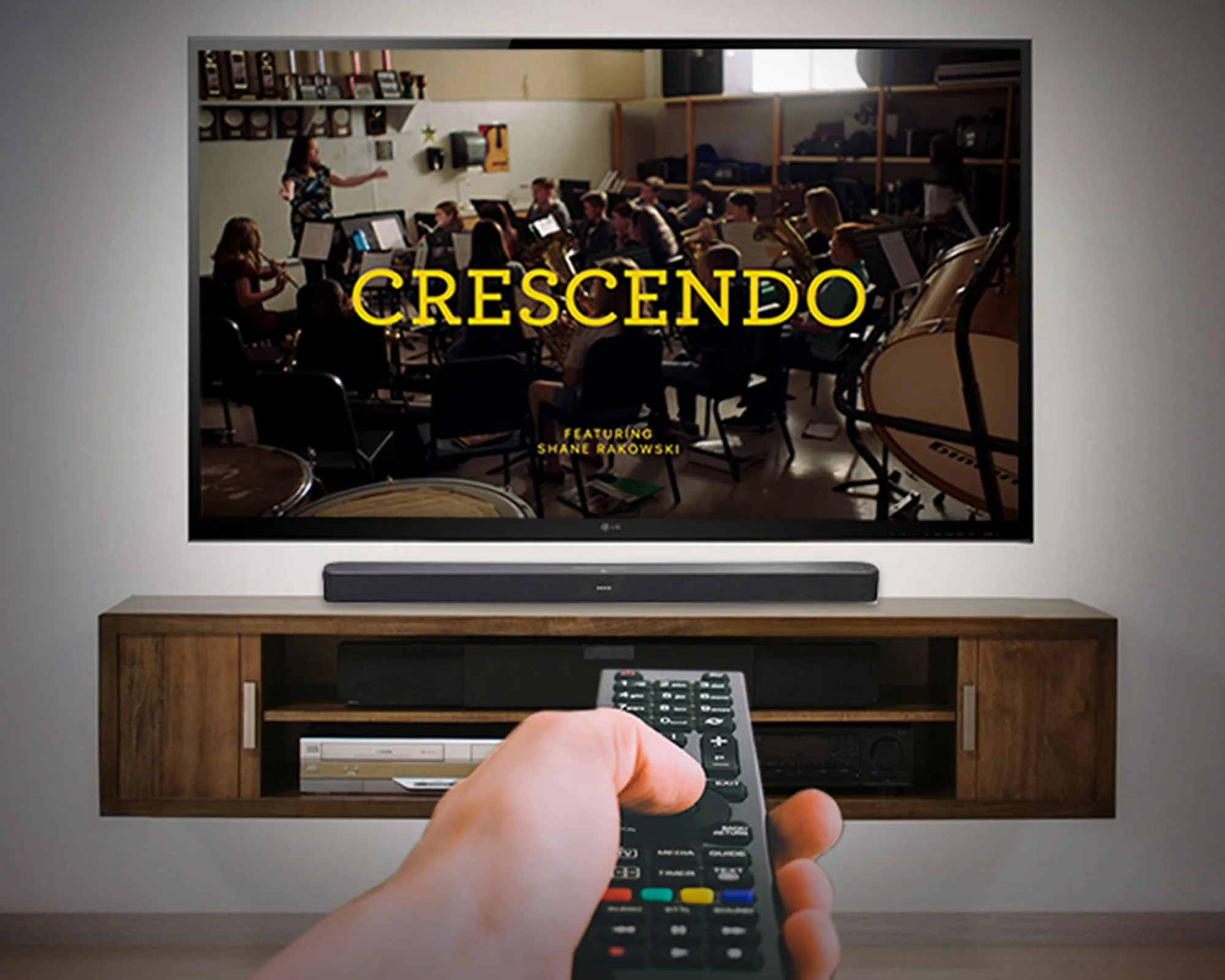
Designed for Shane R. — Apple
https://youtu.be/mswxzXlhivQ
Designed for Patrick L. — Apple
https://youtu.be/cpYUnd64BUM
Designed for Ian M. — Apple
https://youtu.be/iE4KbWIaehQ
Designed for Andrea D. — Apple
https://youtu.be/05fAuDgstbQ
Designed for Meera P. — Apple
https://youtu.be/69vUaEFeIzQ
Designed for Todd S. — Apple
https://youtu.be/evj-eQO49xI
I was brought on as a Production Designer for the “Designed For,” video series, because an Art Director was out of town till the campaign launch. This six part video series was set to launch on Global Accessibility Awareness Day and would go on to be shown on broadcast TV as well as online.
My role for this project was to create and export out the title cards for the video series as well as create title cards that were translated into different languages.
Duration: September 2016 - December 2016
Tools: CS6 Indesign, Illustrator, Power Point
My Role: Art Director / Designer
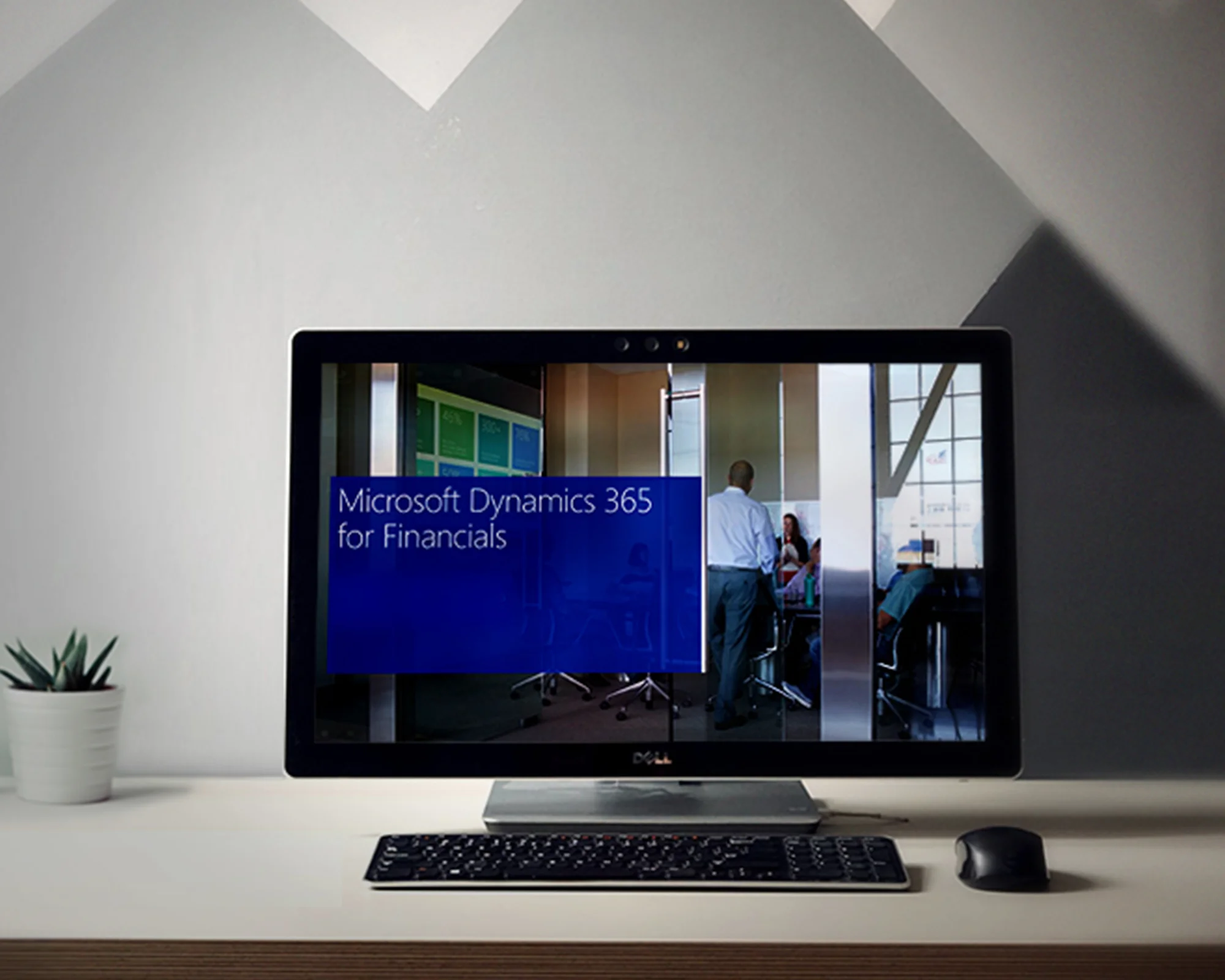
For this project, I worked with Doremus in their San Francisco office with their client Microsoft on creating a few branded pieces that would live on the refreshed Microsoft Dynamics 365 for Financials launch. These resources were for prospective customers. I created a 1 page pricing guide for digital and print, a 2 page battle card for the sales team to use as a reference for sales calls. This piece was built in Powerpoint. I maintained a presentation deck that was also a available as a digital resource on the M365 website. I created digital device illustrations that were used in this presentation deck. I also worked on a partners marketing guideline that helped show how to use their branding properly with Microsoft assets, so for example we have some mocked up digital ad banners as a reference.
Duration: September 2017 ( 1 day )
Tools: Adobe CC 2017 Photoshop
My Role: Art Direction
In Fall 2016, I had worked with San Francisco State University's entrepreneurial student startup organization, Incubed, as a Visual Designer and Art Director on San Francisco State's first ever TEDx Conference. This year we wanted to push the branding even further as well as boost social media presence. I sent over their designer some quick mockups of how their social media and branding could look.
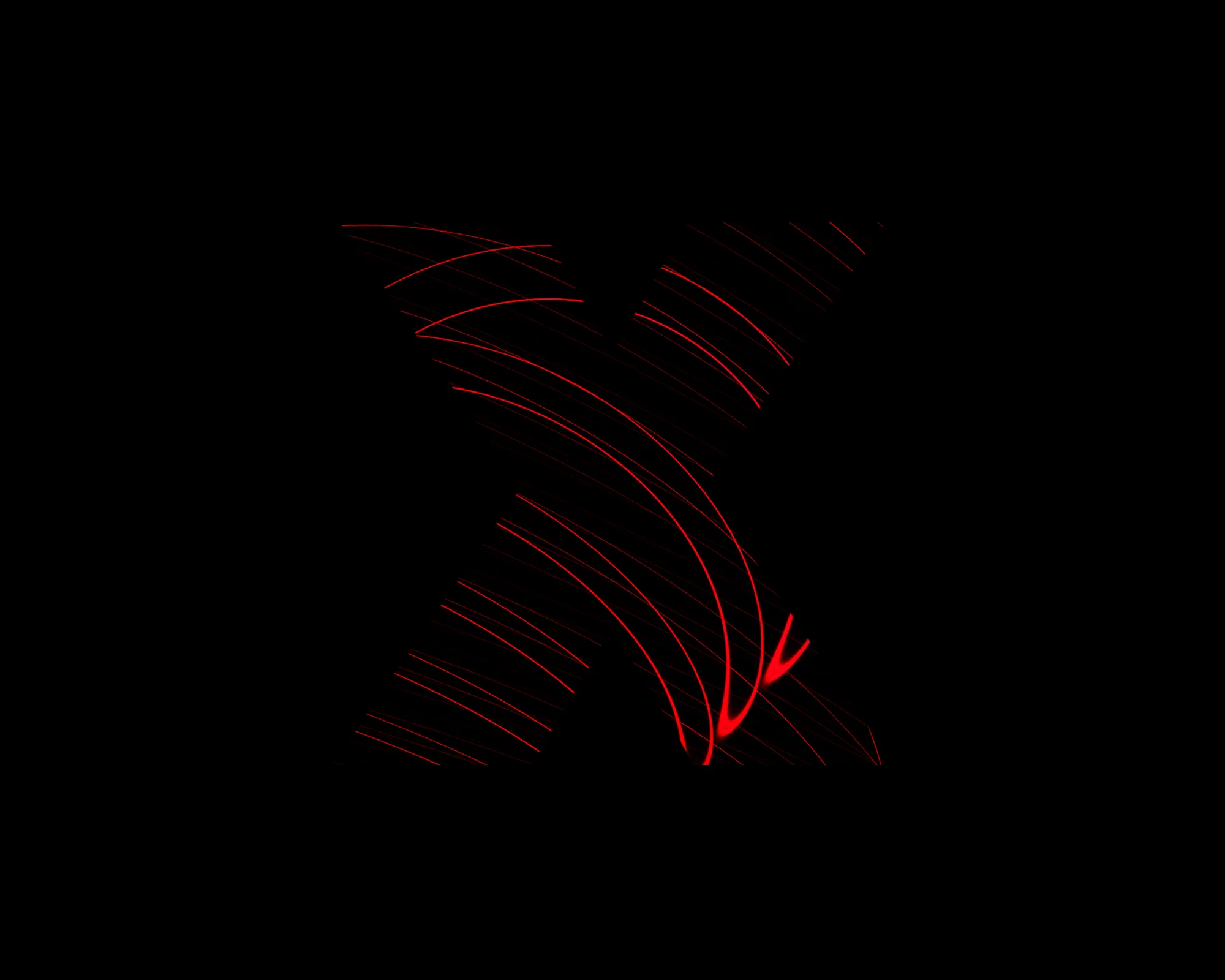
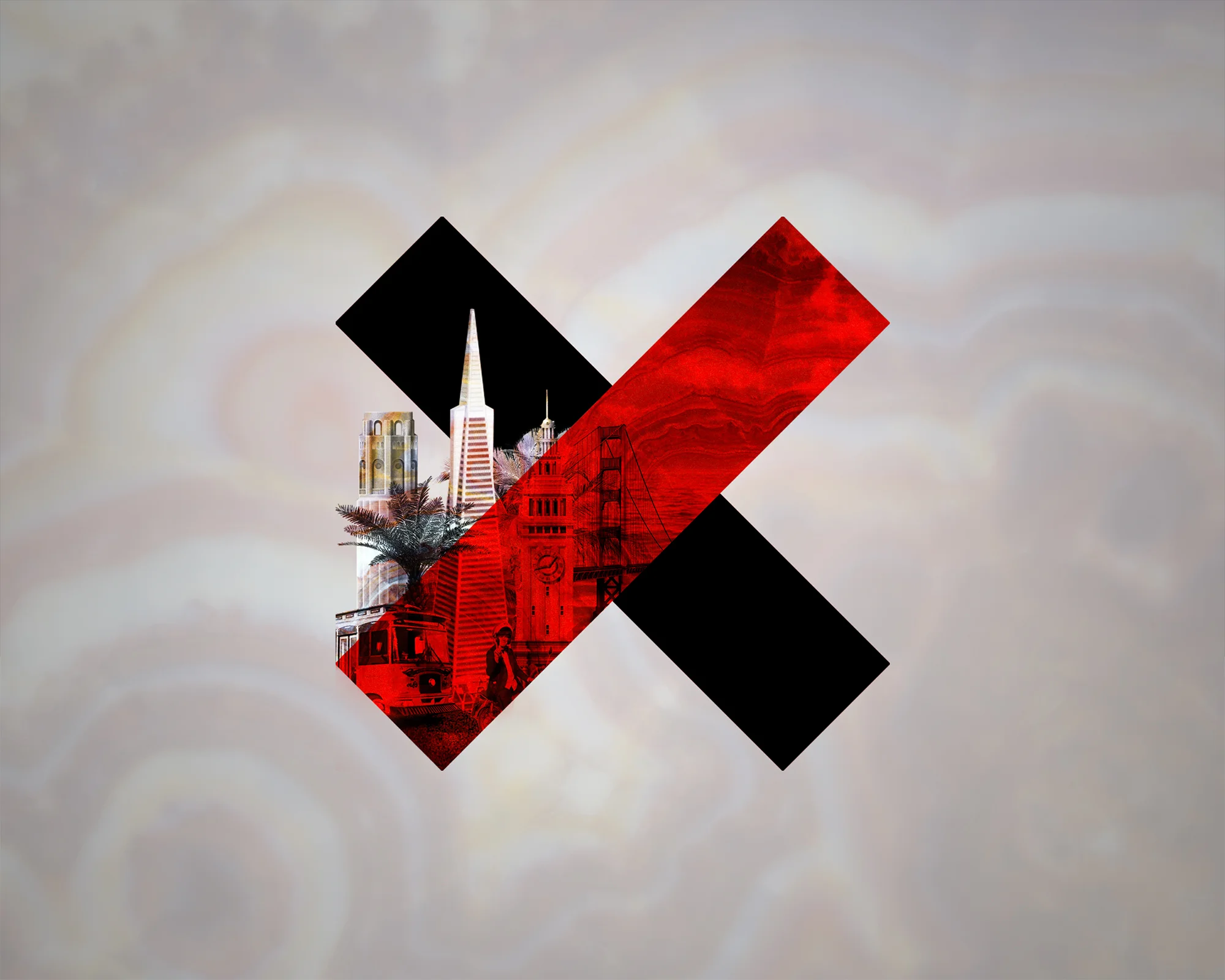
The goal was to show how you can take a graphic element, establish it as a mark, in this case it's the "x" in Tedx and I've masked is with beautiful high quality imagery, sparks, abstract curves and particles.
The second set of three I showed graphic treatments on how photography could be established. The idea was to heavily overlay the image as a background element and if we went on to create social posts, posters, or postcards we would still be able to incorporate typography on top without it getting lost.
I targeted three social media channels, facebook, twitter and linkedin.
Under each web mock-up are mobile insitu versions of how these ideas could work. It's important to check that your graphic and photography elements are translatable to different screen sizes and formats.
This was a quick exercise in compositing for me. I received and email from TEDxSanFrancisco announcing registration is open for the event. I was dissatified with their branding choices, so I went ahead and updated it with a higher quality composite and typography that had more hierarcy layed out.
Duration: November 18 - 20, 2016
( 3 days - Friday, Saturday, Sunday )
Tools: Adobe CC Photoshop
My Role: Art Director
With Cutwater I worked on an exploration in branding for a social media campaign for Sparkle Paper Towels. I also contributed frames to a storyboard for a presentation deck. Cutwater had won the pitch, but they wanted to do more exploration on branding ideas.
The idea was to explore a brand refresh for the consumer budget friendly, Sparkle Paper Towels. Our tagline was "Own Your Shine," and it was about feeling confident. To graphically show confidence we wanted to used bold and punchy typography lockups. Sparkle Paper Towels also has a mascot —Keri the fairy. Through storyboarding we also explored the idea of giving Keri a makeover, Project Runway style!
The social media channels we targeted were Instagram and Facebook. Our messaging was to showcase different situations of "Owning Your Shine". For example, for Instagram we have photos of silly, yet confident looking dogs in costumes with the tag #OwnYourShine. For Facebook, we wanted to lead with the idea of a sneak peak that Keri was going to get a makeover so we used imagery that would hint at this idea. For Four messaging for Facebook, we also showed cased some Pinterest Fails, yet still leading with the idea of "OwnYourShine," feeling confident in maybe some not-so-confident scenarios or best moments.
Finally, we have some Amazon banner placements for an animated ad banner.
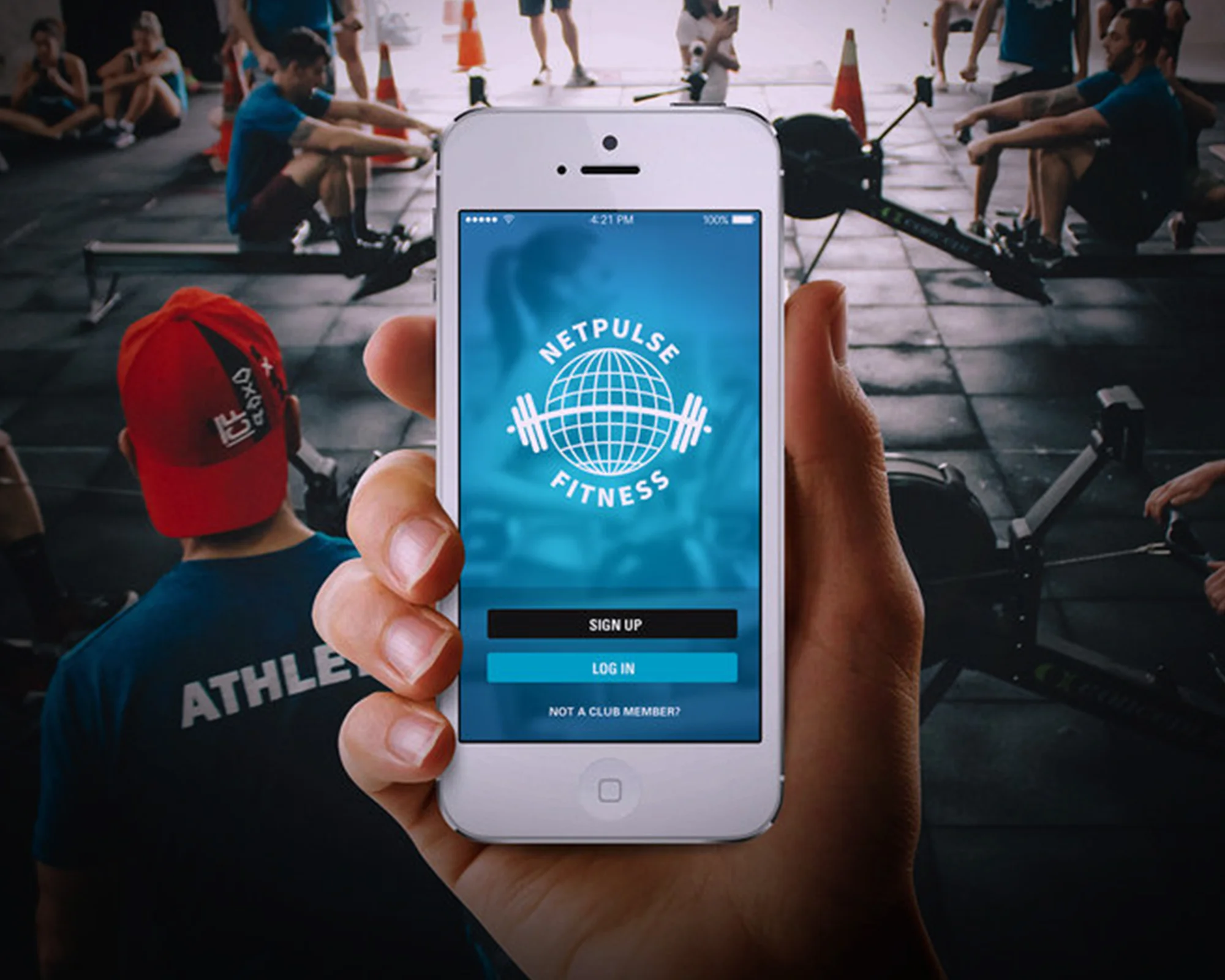
Duration: November 2014 - December 2015
Tools: Adobe Photoshop, Indesign, illustrator, Google Drive, Sheets, Docs, Atlasssian Confluence, Jira, Jenkins.io, Segment.io, Localytics, Hubspot Marketing, Hubspot Sales, Zendesk, Podio, App Store Development Console, Slack, Skype, GoToMeeting
My Role: Mobile Production Designer
While at Netpulse, I created over 250 unique branded mobile apps for fitness centers both SMB and Enterprise clients. I created club branded presentations that showcased all the UI elements that a fitness club could customize for their mobile app. Once the client gives approval, the app would be built for both Android and iOS platforms.
We had an in-house made tool that would build the apps, by placing in the design elements, customizing the colors for the UI, and enabling features. I used this tool to build our apps after client approval for their final design. After the app was build I would QA it on different mobile devices to make sure there were no inconsistencies. I would also generate app store submission assets that would be used in the Google Play store as well as Apple iTunes App Store.
If there were inconsistencies with the builds, I would write to our development team for fixes. When we were planning out new integrations how they would work with our tool I would often help QA these in regards to how design would be affected. For Enterprise clients we also had the option of creating a custom app, in which case we would have to rethink the UI. I also supported the first international launch of our app in 12 languages.
Some notable clients I worked with were Goodlife Fitness, YMCA various locations, Gold's Gym, Youfit.
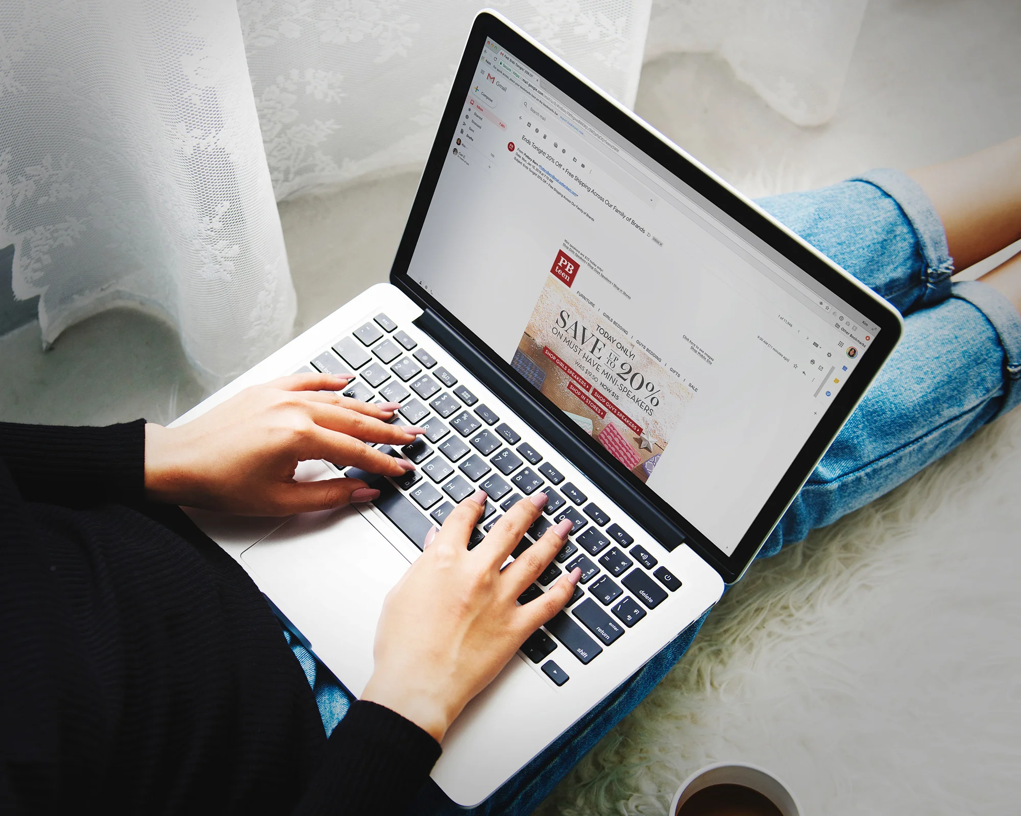
Duration: October 2014 - November 2014
Tools: CS5 Illustrator, CS5 Photoshop, CS5 Indesign, ASANA, HTML5 / CSS3,
My Role: Visual Designer / Production Designer
I worked as an Email Production Designer with William Sonoma Inc's, Pottery Barn Teen brand. During my time here I worked on creating Holiday Email Campaigns for a series of products that the Company wanted to highlight. In house product photography was used. My team consisted of a Lead Email Designer, A Web Designer, and a Creative Director, where we would have regular checkins.
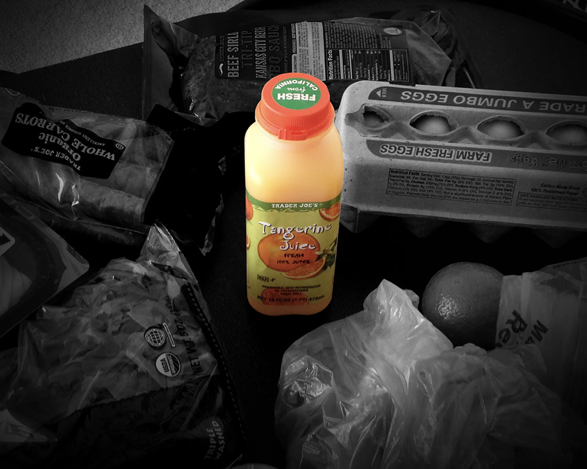
Duration: January 2014 ( 3 weeks )
Tools: Adobe CC Photoshop
My Role: Visual Designer
This was an exercise from a 3 week packaging class that I took at San Francisco State University during their Winter Session. One of the exercises we did was to explore the lifecycle of a consumer product and storyboard it's journey.
I chose an every day item, a tangerine juice container.
Frame 1 shows the product on the shelf,
ready to be picked up.
Frame 2 shows the product placed in
the cart.
Frame 3 shows the product being packed
away in a backpack with the rest of the
groceries on the shopping trip.
Frame 4 shows the items unpacked.
Frame 5-9 shows the product being
consumed.
Frame 10 shows the product being
placed in recycling bin in the house.
Frame 11 shows the product being
taken to a dumpster.
Frame 12 shows the product placed
in the dumpster
This concludes the consumer interaction with the product. Of course the product lifecycle is larger, with that we need to account for product production and also the recycling process. The consumer only touches the the mid portion of the product lifecycle.
Duration: March 2014 - April 2014
Tools: CS6 Illustrator, CS6 Photoshop,
My Role: Visual Designer
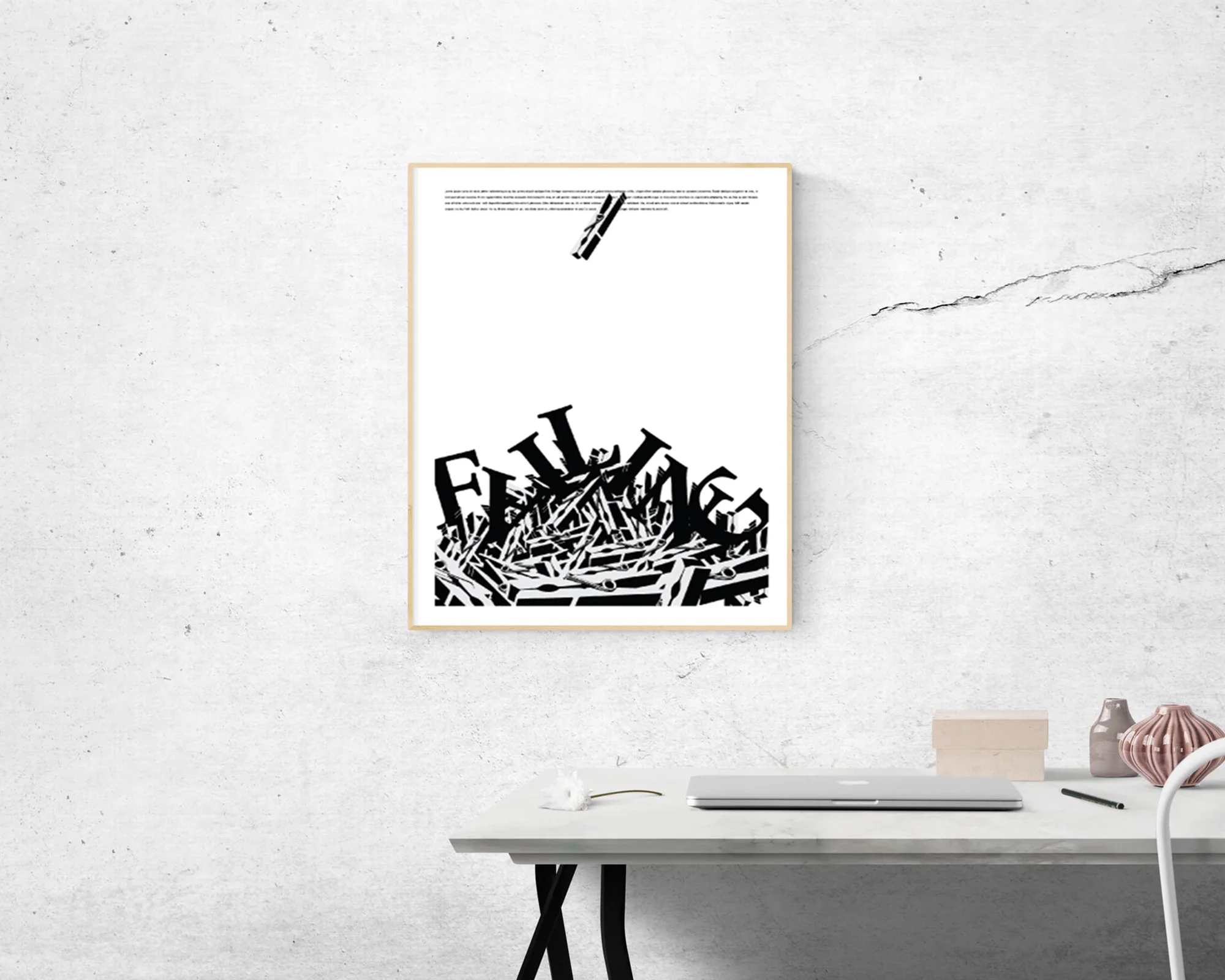
The goal of this project was to create a composition from found objects where we manipulate contrast, repetition, alignment and proximity. The copy came from the tragic event of the Malaysian jet-liner accident, from a CNN article. The clothes pins piled at the bottom represent the casualties from the accident. The title copy, “FALLING,” is juxtposed on top of the pile. The chaotic feeling is contrasted with a gentle gliding feeling of a single clothes pin. This was a fun project for me, because the concept was really simple and I liked the idea of turning it into something complex.
Process:
( 1 ) Photograph object.
( 2 ) Import in photoshop, convert image to black and white and adjust levels for maximum contrast.
( 3 ) Import into illustrator, separate the highlights from the shadows, trying to achieve the best object reduction by adjusting highlights, midtones and shadows.
( 4 ) Create a composition of the found object. Include object, 3 colors (in this case, I chose black white and grey), title and copy.
My intention was to create a sense of depth with this composition. Even though the requirements of the project were minimal, I experimented with trying to take it to the next step.
Images provided by Kim Covey (http://kim-covey-gen.squarespace.com). All rights reserved.
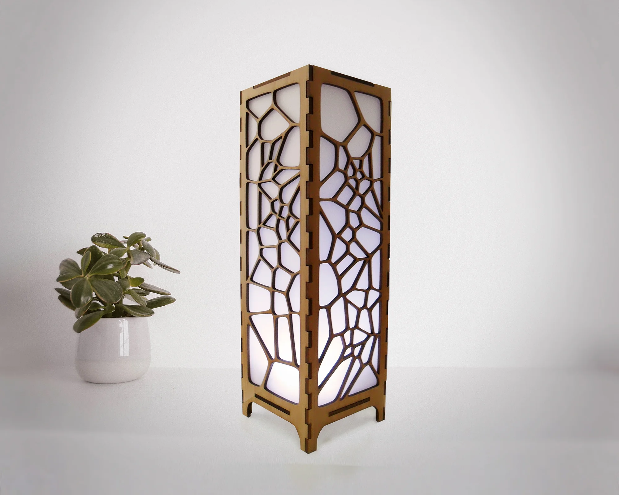
Duration: March 2012 ( 2 days )
Tools: CS4 Illustrator, Autodesk Inventor, Epson 60 Watt Lasercutter
My Role: Visual Designer, Illustrator, Model-maker, Assembly
Inspired by organic structures and forms found in nature (i.e. insect wings, cell structures), this is a lamp design based on the Voronoi Tessellation. This was a really fun side-project that I enjoyed working on. I had not used Autodesk inventor before, so it was a good, learning experience for me as far as 3D Sketch-up tools go.
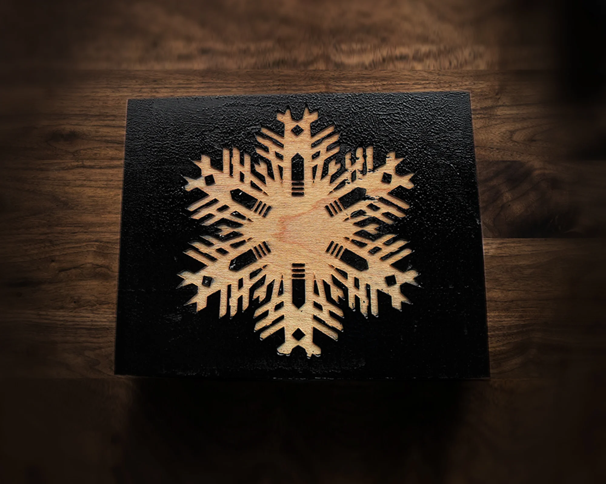
Duration: January 2012 - March 2012
Tools: CS4 Illustrator, Epson 60 watt laser cutter, wood, ink,
My Role: Visual Designer
These are Laser Engraved Woodblocks made for my Greeting Card Project for my Letterpress Class. This was an alternative method to the photo polymerization plate method for creating an illustration for our card.
Duration: March 2011 - April 2011
Tools: Illustrator, Pencil, Pen, X-acto Knife, Cutting mat, glue, ruler
My Role: Illustrator, Model-maker
This was a project for my drafting class. Before we got into our perspective unit we made a paper craft cube to help us explore drawing 3D spaces.
Duration: March 2011 - May 2011
Tools: Illustrator CS4, Epson 60 Watt Laser Cutter
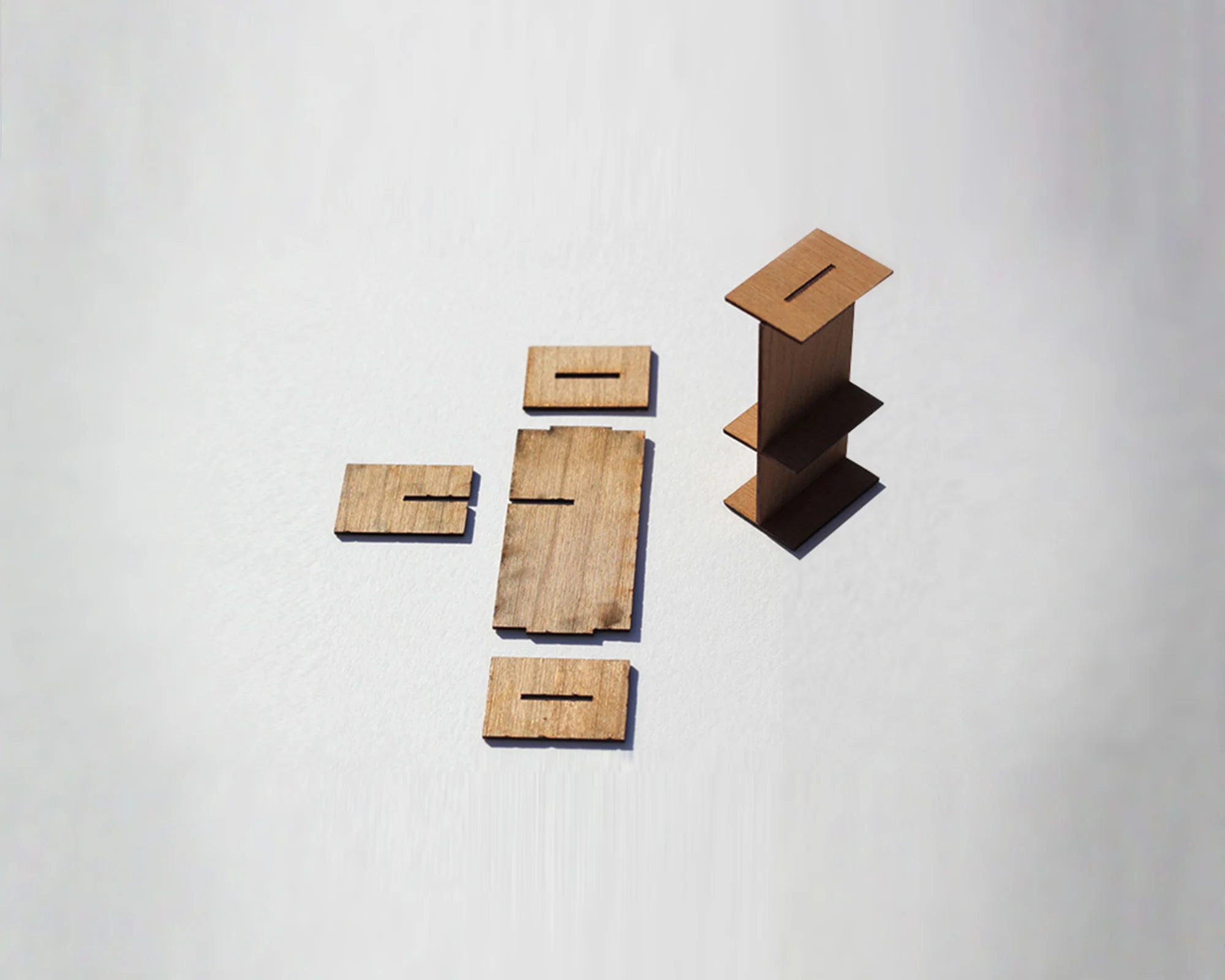
My Role: Production designer and model-maker - Created illustrator template of exhibit booths to be lasercut. Model lasercutter and model assembly. Material testing. Print setting optimization.
I created 1/48 scale models of the physical exhibit structures for a scale model floor plan of Jack Adams Hall, a campus-wide conference room, located at San Francisco State University. This was for our department's annual student design show, featuring the work the students from the design and industry department work on year long. The model was to featured as the centerpiece of this year's student design show.
I mocked up the structure from the spec sheet in illustrator. Once I had my design created I began a testing process where I needed to figure out the best material to use for the model. I first tried balsa wood, wood, but this wood proved to be too brittle. After testing different modeling wood, that was available and sizes, I found 1/8 inch cherry was the best material. Cherry was a better choice over balsa wood because Cherry is a tougher material and holds together better in thinner sheets. I also had to determine the best settings for the laser cutter, my goal was to not have any burn around the edges, I wanted my model pieces to fit together tightly, as if they were not going to had any adhesive applied to keep them together. The burn from the laser shaves off a small amount of material, which needs to be accounted for in the measurements. Once I found the appropriate settings between power, speed, and frequency, I was able to cut and then assemble the structures. The size of each structure is about 1 inch.